paths – we start talking about space and place
Omaggio a Gillo Dorfles – il pittore clandestino – il MAC
La seconda sezione della mostra su Dorfles, dedicata al MAC -il Movimento per l’Arte Concreta-, occupava l’intera superficie del parterre del PAC, il lungo open space che si affaccia sul giardino (4.01).
Il percorso prevedeva che si arrivasse al MAC dopo aver attraversato la galleria dei box. Scesa la breve rampa di scale, i visitatori proseguivano attraverso 5 sottosezioni, ognuna delle quali corrispondente -nell’ordine- ancora a Dorfles, alle cartelle di disegni di esordio del MAC nel 1948, e quindi agli altri fondatori: Munari, Soldati e Monnet.[1]
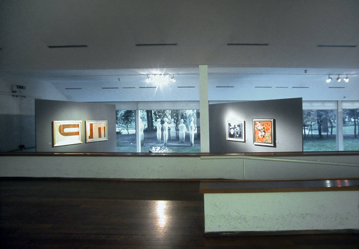
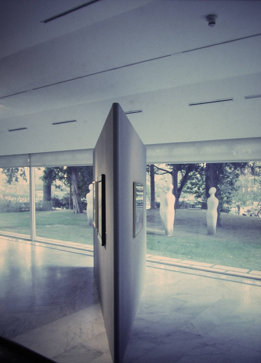
In realtà, i visitatori -all’ingresso (2.2), e poi di fronte ai box della prima sezione (2.7, 2.8, 4.2, 4.3)- avevano già potuto intravedere che nel parterre c’era qualcosa di molto diverso dal resto della mostra.
Perché era diverso?
In effetti, fin dai briefing iniziali con la curatrice, si era compreso che l’allestimento di questa sezione avrebbe dovuto evocare il rinnovamento, lo stacco, che il MAC aveva storicamente prodotto nella cultura e nelle arti italiane: questa sezione doveva perciò a sua volta ‘staccarsi’ dal resto della mostra.
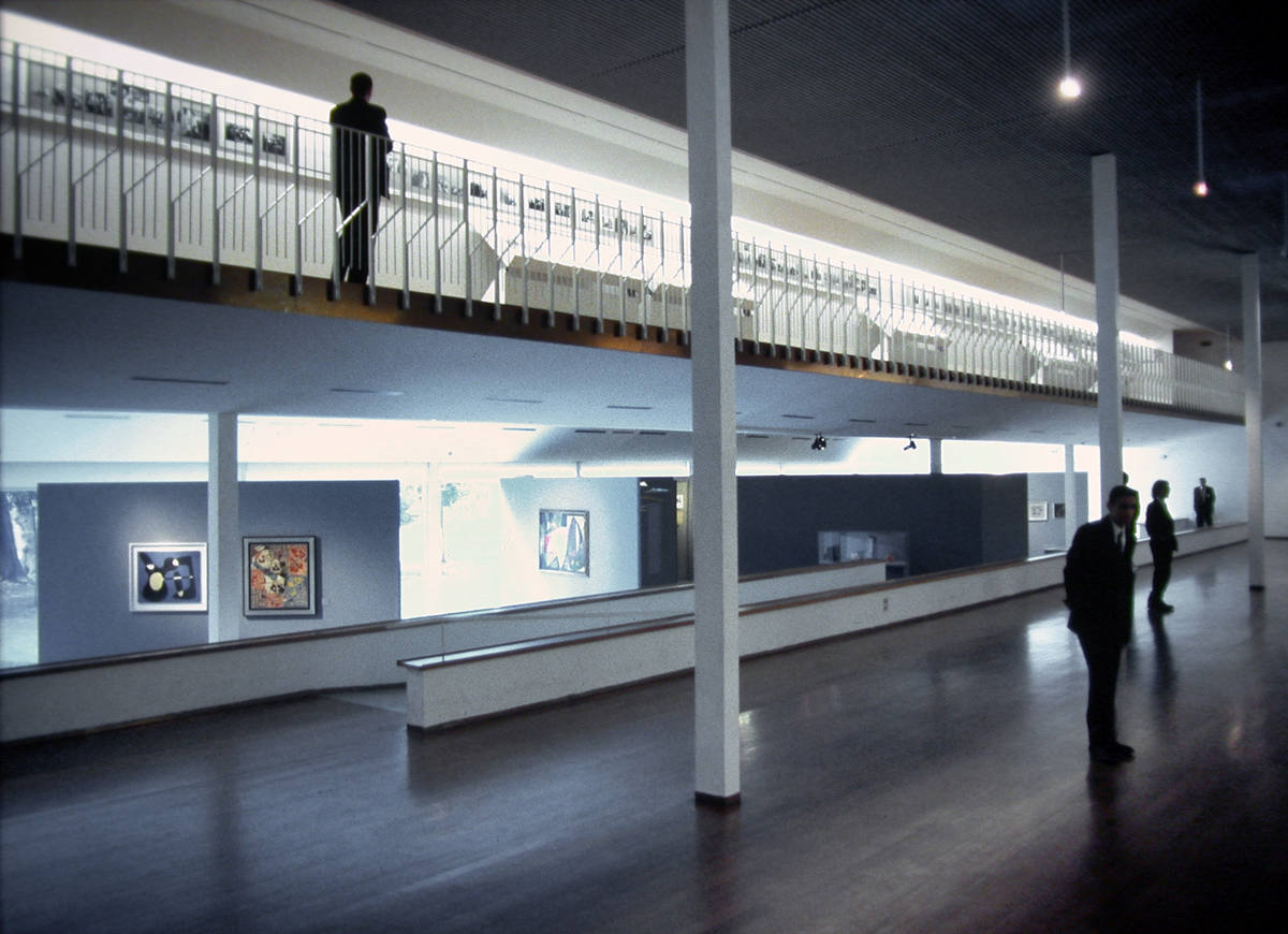
Quindi, per la prima sezione si decise di usare, tali e quali, i box progettati da Gardella: una normale galleria, scatole di muratura, sulle cui pareti bianche dispiegare la sequenza lineare -e cronologica- delle opere di Dorfles.
Per il MAC occorreva invece uno spazio ‘aperto’. Uno spazio configurato dalle relazioni tra elementi distinti e diversi, come diversi erano i quattro fondatori del MAC.
Spatium est ordo [rerum] cohexistendi, teorizzava Leibnitz: lo spazio è l’ordine delle cose che sono presenti simultaneamente. Occorreva costruire un nuovo ordine con un nuovo spazio.
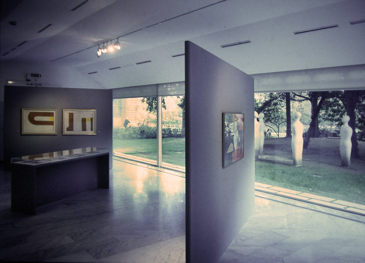
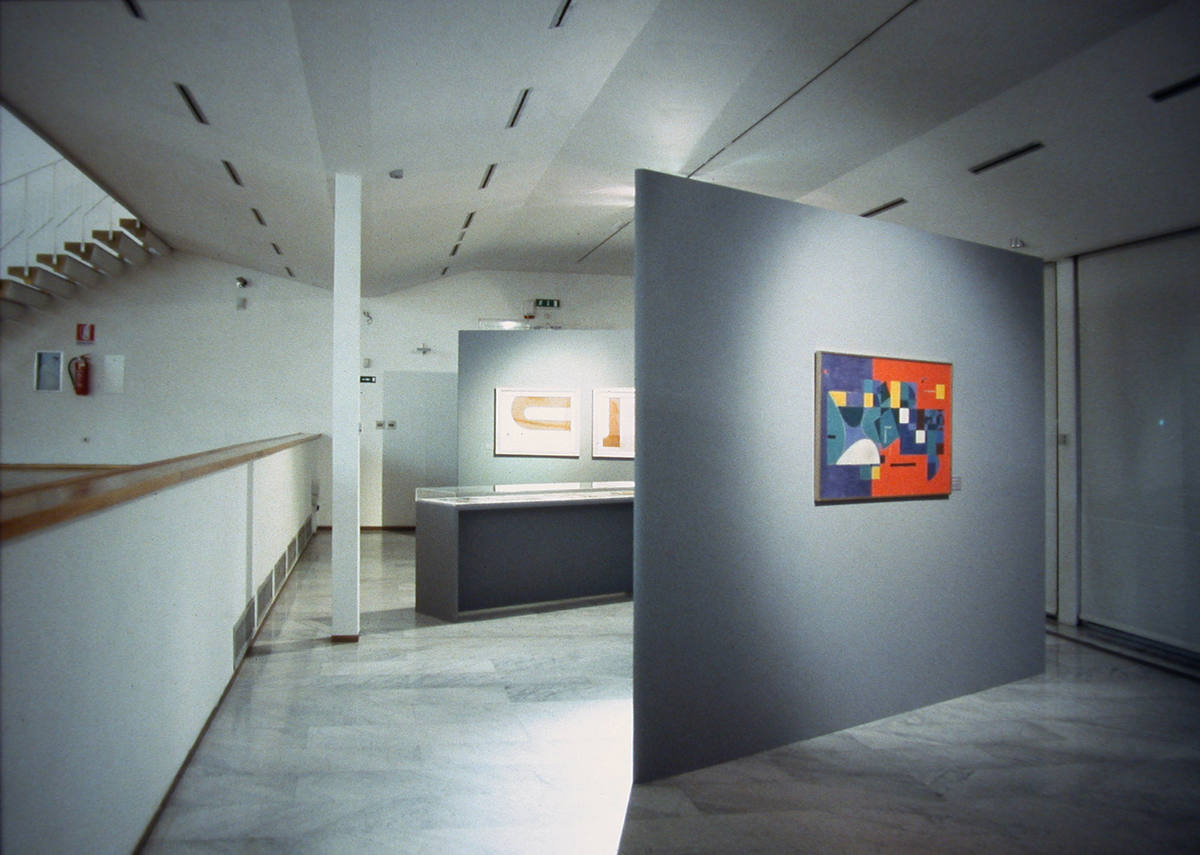
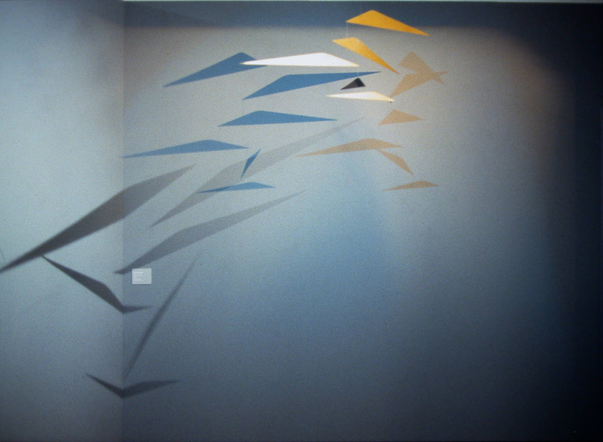
La trama di questo ordine fu affidata alla composizione prismi di base triangolare, liberamente ispirati alle geometrie di Max Huber -non fondatore, perciò non presente nella mostra, ma tra i primi ad aderire al MAC- e al mobile di Munari (4.7, 4.8, 4.9): schegge acuminate, ognuna delle quali -grazie all’accorgimento degli spigoli arrotondati- a seconda dei punti di osservazione assumeva la plasticità di un volume o si smaterializzava in pure superfici di colore grigio scuro. (4.4, 4.5, 4.6)
Ma elementi dell’ordine erano le stesse opere -ad esempio, nelle foto, quelle di Soldati e Monnet-, che apparivano tutt’uno con le superfici smaterializzate, quasi che queste fossero solo dei passepartout.
Schegge ed opere si rinviavano e si specchiavano l’una l’altra generando e scandendo uno spazio -appunto- mai chiuso, libero, instabile e interrotto, come le ombre del mobile.
Nell’articolazione di quello spazio il percorso perdeva ogni successione lineare. Il visitatore si muoveva tra le schegge, tra un’opera e l’altra, attratto ora dall’una ora dall’altra, mettendo a confronto le differenti anime dei fondatori.
Se proprio vogliamo trovare un’analogia ex post, il manifesto del MAC all’inizio della sezione (4.12) -a firma di Dorfles- forse anticipava la ‘logica’ dei possibili percorsi tra i nuclei di opere.
Per rimarcare la differenza tra i box e lo spazio del MAC, particolare attenzione fu riservata anche alla luce: riflessa, omogenea e morbida nei box; diretta, frammentaria e tagliente nel MAC.
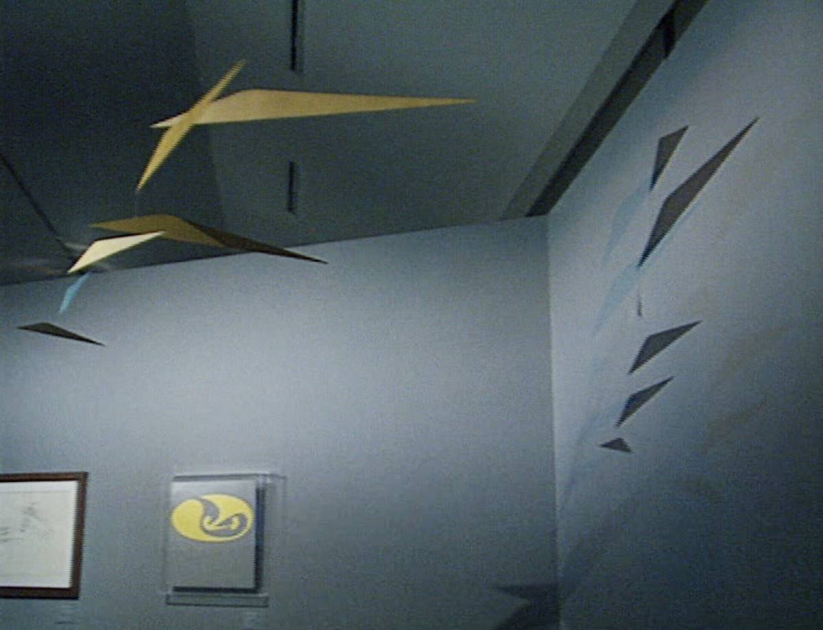
In particolare, nella zona dedicata a Munari, la luce incrociata di due sagomatori di colori diversi (azzurro e giallo-oro) permise di ‘moltiplicare’ il mobile -mosso costantemente dalla griglia d’aria a pavimento-. Sulla parete, le ombre proiettate dell’uno si muovevano assumendo il colore dell’altro (4.7, 4.8, 4.9).
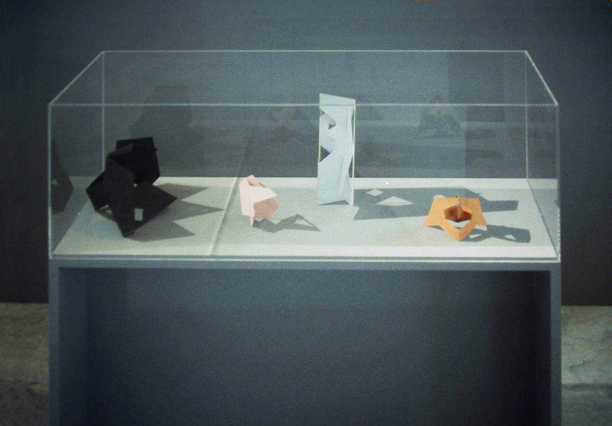
Un altro sagomatore di luce bianca, poi, ritagliava le ombre delle sculture da viaggio esposte nella vetrina (4.10).
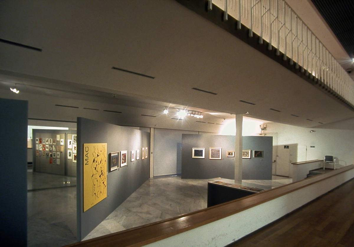
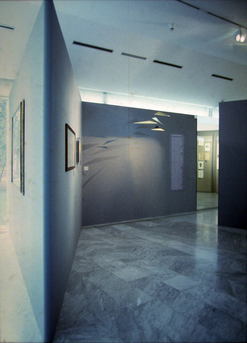
Ma il coup de theatre vero, gli spettatori, lo trovarono nello spazio predisposto per le cartelle di disegni.
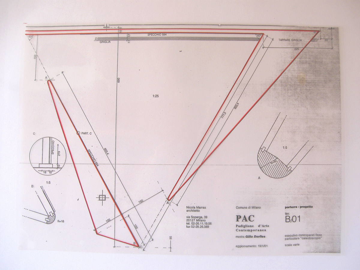
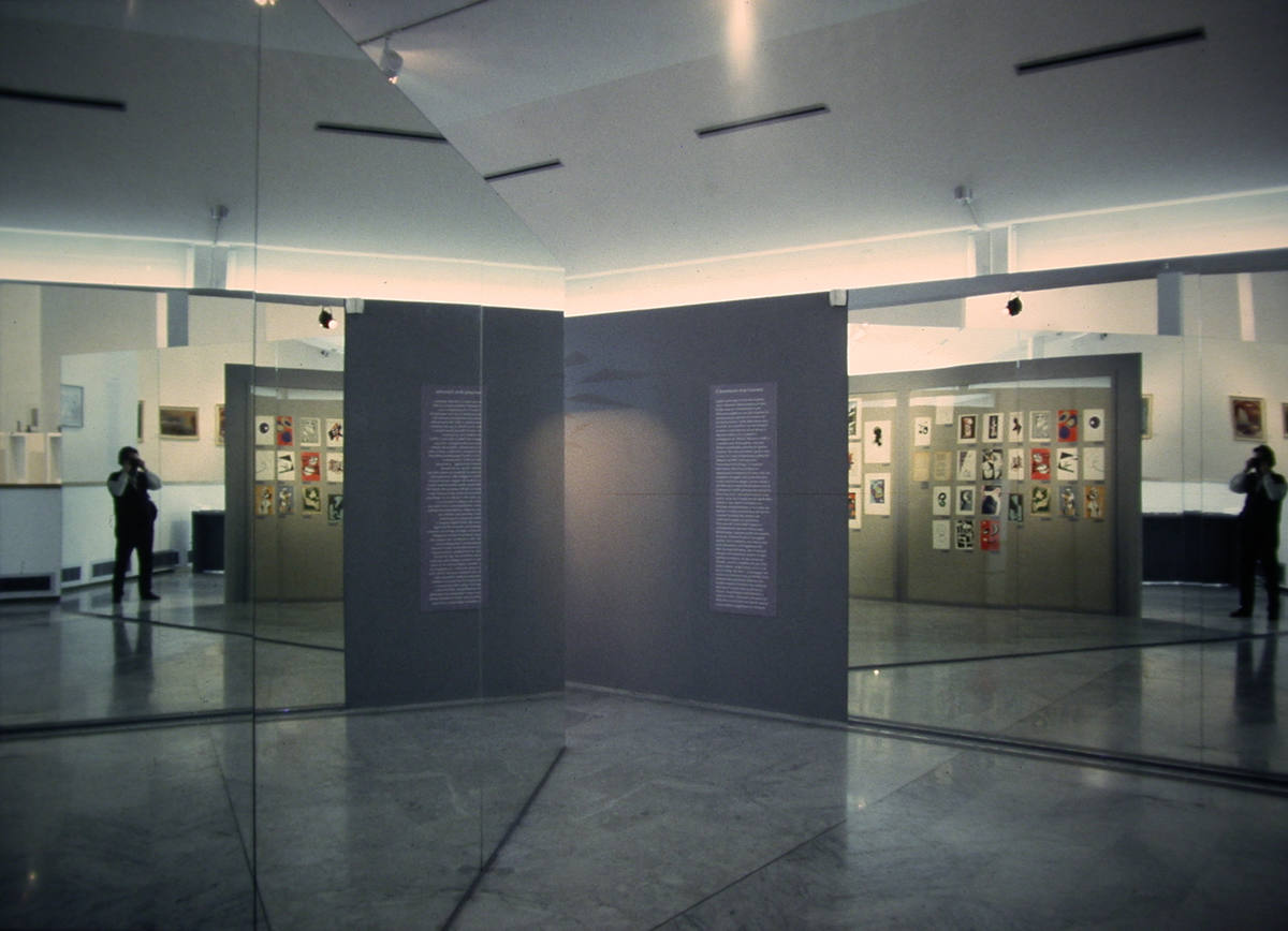
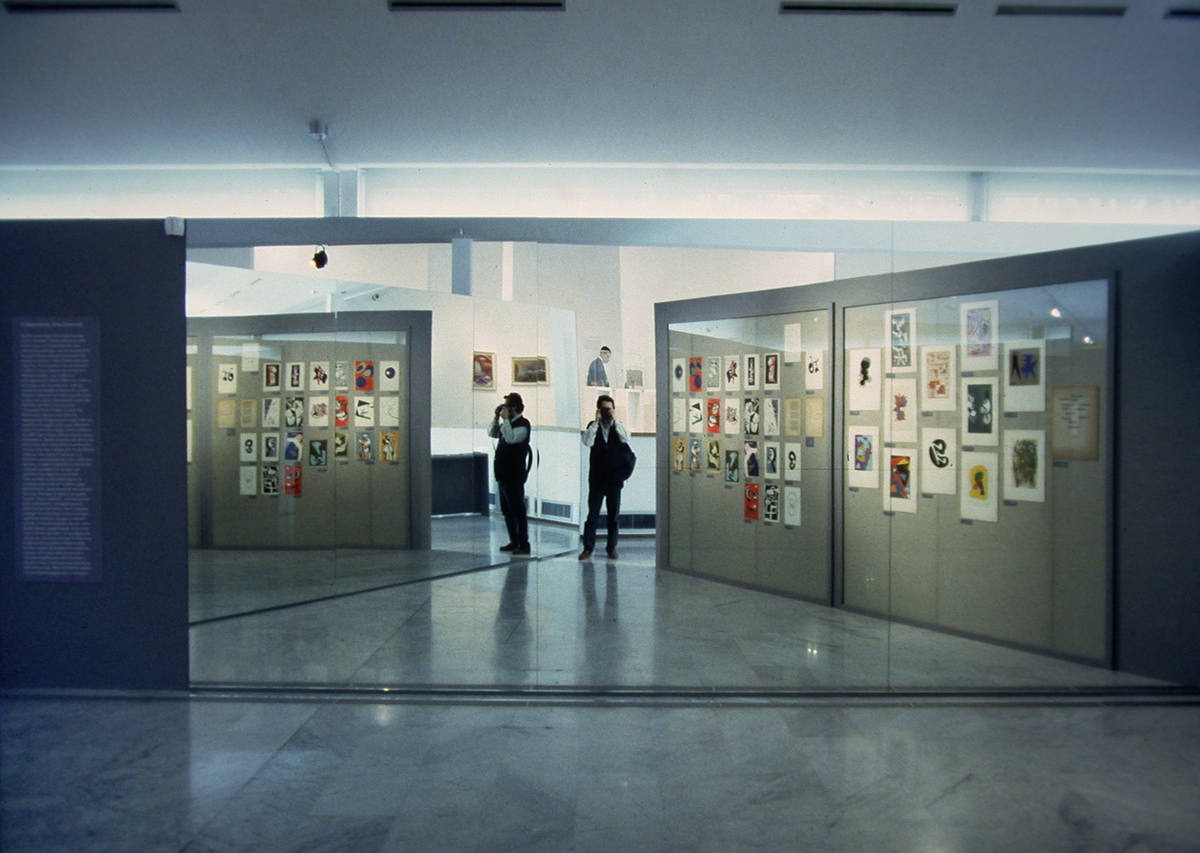
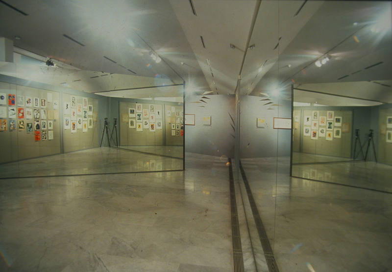
In pianta un triangolo equilatero (4.11). In alzato, tre pareti: accanto all’ingresso, quella di spalle a destra, coperta da cristalli a protezione dei disegni, le altre due, di fronte, rivestite di specchi a tutta altezza.
Foto e video, purtroppo, non restituiscono l’esperienza del visitatore.
Entrando (4.13, 4.14, 4.15 ), questi si trovava per un attimo come nella girandola di un caleidoscopio orizzontale, moltiplicato lui stesso insieme ai disegni e alle pareti in quello che gli appariva -tra illusione e realtà- come il fantasma roteante di un padiglione a pianta esagonale.
Ma perché questo ‘scherzo’? Certo, occorreva evocare lo shock che il Mac aveva prodotto nella cultura italiana, ma era anche necessario fare in modo che il visitatore comprendesse -anzi: sperimentasse lui stesso- quanto di ludico era presente in quello shock, nell’idea dell’arte promossa dal MAC (si pensi già soltanto a Munari), e, infine, occorreva alludere a tutti gli altri artisti e architetti che il MAC aveva ispirato -e che non potevano essere presenti nella mostra-.
Come è nata l’idea di questo spazio?
Io sono un mancino primario e speculare, e sono sempre stato affascinato dalla magia degli specchi: una fonte inesauribile di incantesimi della quale ho spesso approfittato anche nel nostro mestiere. Ma ben prima di me ci sono stati allestimenti entrati nella storia proprio per l’uso geniale delle proprietà degli specchi.
In attesa di dedicar loro una clip, qui occorre segnalarne almeno uno.
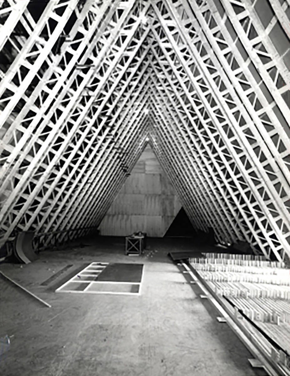
Il primo e più importante antecedente è del 1964: è la fantastica sala del caleidoscopio (4.18) di Vittorio Gregotti per la Tredicesima Triennale -dedicata al tempo libero e alla società dei consumi: erano gli anni di quello che fu poi chiamato il Boom Economico-.
Fu allestita all’interno del Salone d’Onore del Palazzo dell’Arte, per la sezione introduttiva dell’evento -curata insieme a Umberto Eco-.
Il triangolo equilatero -vedi la sezione schematica del Salone (4.16) e la struttura durante il cantiere (4.17), con la base coincidente con il pavimento e i lati inclinati di 60° rivestiti di specchi- generava l’illusione di una straordinaria galleria da lunapark, di dimensioni -ed emozioni- proporzionate e coerenti al tema epocale di quella Triennale. Altri specchi -verticali- chiudevano le testate, allungando la galleria all’infinito.
Tutta la luce era quella prodotta da filmati o diapositive proiettati dal vertice superiore del triangolo sul pavimento e sugli stessi visitatori.
L’illusione doveva essere davvero entusiasmante.
Quattro osservazioni.
Prima osservazione.
Riprendendo le nostre analogie, se la punteggiatura dei box rimanda alla linearità della scrittura, l’articolazione di spazi interrotti del MAC rimanda alle tavole parolibere. L’allestimento della sezione del MAC fa vedere che, nell’ordinamento delle opere di una mostra, alla successione temporale -come quella delle opere nei box- si può contrapporre la simultaneità -come quella propria di un ordine affidato alla composizione di prismi e opere nel parterre-. Fa vedere che alla punteggiatura di opere disposte una dopo l’altra si può rispondere con il contrappunto e il gioco più complesso di opere che coesistono nello stesso spazio.
Ovviamente, se per il MAC la contrapposizione tra questi diversi modi di legare temi e opere in mostra era voluta e amplificata come un artificio retorico, occorre rimarcare che nella realtà, come vedremo, i due modi non sono mai nè realmente separati, né tra loro avversari: anzi variamente si dividono e si uniscono, si intrecciano e si sovrappongono, e comunque si rinforzano giocando tra loro.
Tentati da un’altra analogia, paragonando il progetto del percorso di una mostra alla scrittura di un brano musicale, potremmo dire che nella mostra quei due modi si rinviano l’un l’altro come nella musica la melodia e l’armonia.
Seconda osservazione.
Se il percorso di una mostra non è riducibile né alla sequenza lineare, né alla coesistenza in un unico spazio delle cose esposte, allora va inteso come la struttura narrativa delle relazioni tra le cose esposte e tra queste e il visitatore.
Dunque, chi progetta il percorso di una mostra -così inteso-, deve rinunciare alla tradizionale illusione della linearità per ricorrere ad un diverso paradigma, per riconoscere modi e strumenti di quella ‘narrazione’.
Terza osservazione.
La sezione del MAC all’interno del Padiglione d’Arte Contemporanea e a maggior ragione la sala del caleidoscopio all’interno del Palazzo dell’Arte introducono nelle nostre riflessioni un’altra proprietà dell’allestimento, o forse un suo fondamentale compito: costruire un luogo in un altro luogo, inventare il luogo della mostra all’interno di qualsiasi altro luogo preesistente, dare un luogo alle opere esposte.
Quarta osservazione.
Costruire un luogo per far vedere, o per far capire, o per far sentire… Cosa significa?
Significa che l’obiettivo al centro del progetto, il destinatario primo ed ultimo dell’allestimento, è il visitatore. Come abbiamo già detto (link), significa che il progetto dell’allestimento è il progetto dell’esperienza che il visitatore farà delle cose o delle idee esposte.
Nel caleidoscopio di Vittorio Gregotti e Umberto Eco non ci sono nemmeno opere o idee. Gli specchi e le proiezioni che si rovesciano e si moltiplicano all’infinito creano un luogo che serve soltanto a emozionare, a sorprendere il visitatore. Le reazioni del visitatore, la sua esperienza: questo è l’obiettivo dell’allestimento.
Si può poi ragionare. Queste reazioni, questa esperienza sono la rappresentazione -o la metafora- della parte che gli è riservata nella società dei consumi? Potrebbe dunque essere un monito malizioso? Il caleidoscopio potrebbe essere un luogo che serve per intensificare la sua vita svuotandola del tutto?
Ma l’invenzione dei luoghi, nelle mostre, serve proprio per imparare a vedere.
Anche a questi compiti, di cui la storia degli allestimenti ricorda esempi magistrali, dovremo dedicare alcune delle prossime clip.
[1] Questa sezione della mostra si prefiggeva di rappresentare brevemente soltanto l’esordio del MAC. Dunque fu esclusa l’esposizione di opere di tutti coloro -artisti, architetti, etc.- che aderirono successivamente al movimento.
…………………………………………………………………………………………….
![]()
paths – we start talking about space and place
The second section of the exhibition on Dorfles, dedicated to the MAC -the Movimento per l’Arte Concreta-, occupied the entire surface of the parterre of the PAC, the long open space overlooking the garden. (4.01)
The path led to the MAC after crossing the gallery of paintings. After the short flight of stairs, the visitors continued through 5 subsections, each of which showed -in succession- some works of Dorfles that anticipate the Movimento, then the folders of MAC’s debut drawings in 1948, and finally a limited selection of works of the other founders of the MAC:Munari, Soldati and Monnet. [1]
Actually, the visitors -at the entrance (2.2), and then in front of the rooms of the first section (2.7, 2.8, 4.2, 4.3)- had already seen that in the parterre there was something very different from the rest of the exhibition.
Why was it different?
From the initial briefings with the curator, it was understood that the staging of this section should have evoked the renewal, the detachment, that MAC had historically produced in Italian culture and arts: this section was therefore to ‘detach’ from the rest of the exhibition.
So, for the first section, it was decided to use the rooms designed by Gardella: a normal gallery, masonry boxes, on whose white walls unfold the linear -and chronological- sequence of the works of Dorfles.
For the MAC, an ‘open’ space was needed. A space configured by the relationships between distinct and different elements, as the four founders of the MAC were different.
Spatium est ordo [rerum] cohexistendi, theorized Leibnitz: space is the order of things that are present simultaneously. It was necessary to build a new order with a new space.
The texture of this order was devolved to the composition of triangular basic prisms, freely inspired by the geometries of Max Huber -not founder, therefore not present in the exhibition, but among the first to join the MAC- and by the mobile of Munari (4.7, 4.8, 4.9): sharp splinters, each of which -thanks to the trick of the rounded edges- depending on the observation points assumed the plasticity of a volume or dematerialized in pure dark gray surfaces. (4.4, 4.5, 4.6)
But elements of this order were also the works themselves -for example, in the reportage, those of Soldati and Monnet- which appeared as one with dematerialized surfaces, almost as if these surfaces were only passepartouts.
Splinters and works played and mirrored each other, generating and articulating a space never closed, free, unstable and interrupted, like the shadows of the mobile (4.8).
In the articulation of that space the path lost all linear succession. The visitor moved between the splinters, between this and that work, now attracted by this, now by the that, comparing the different souls of the founders.
If we really want to find an ex post analogy, the manifesto of the MAC at the beginning of the section (4.12) -drawn by Dorfles- perhaps anticipated the ‘logic’ of the possible paths between the cores of works.
To point out the difference between the rooms of the gallery and the space of the MAC, particular attention was also paid to the light: reflected, homogeneous and soft in the rooms; direct, fragmentary and sharp in the MAC.
Specifically, in the area dedicated to Munari, for ‘to multiply’ the mobile -constantly moved by the air conditioning grill to the floor- had been illuminated by crossing two profile spotlights of different colors: on the wall, the projected shadows of the one moved assuming the color of the other. (4.7, 4.8, 4.9)
A further profile spotlight of white light, then, cut out the shadows of the travel sculpturesplaced in the showcase. (4.10)
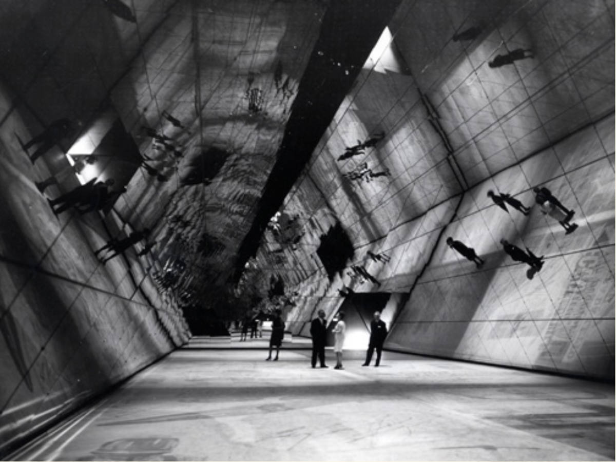
But the real coup de theatre, the viewers found it in the space arranged for drawing folders.
In the plan, an equilateral triangle (4.11). In elevation, three walls: next to the entrance, the one on the right, covered by crystals to protect the drawings, the other two, in front of the entrance, covered with full-height mirrors.
Photos and videos, unfortunately, do not allow to understand the experience of the visitors. As he entered (4.13, 4.14, 4.15 ), he was for a moment like in the pinwheel of a horizontal kaleidoscope, multiplied himself together with the drawings and the walls, in what appeared to him -uncertain between illusion and reality- like the rotating ghost of a hexagonal pavilion.
But why this ‘joke’? Of course, it was necessary to evoke the shock that Mac had produced in Italian culture, but it was also necessary to make sure that the visitor understood -indeed: he experimented himself- how much of playful was present in that shock, in the idea of the art promoted by MAC (just think of Munari), and, finally, it was necessary to allude to all the other artists and architects that the MAC had inspired -and that could not be present in the exhibition.
How was the idea of this space born?
I am a primary lefty and specular, and I have always been fascinated by the magic of mirrors: an inexhaustible source of spells that I have often taken advantage of even in our profession. But well before me, there were exhibition staging that entered history precisely for the ingenious use of the properties of mirrors.
Waiting to dedicate them a clip, here you must report at least one.
The first and most important antecedent date back to 1964: it is the fantastic room of the kaleidoscope (4.18) of Vittorio Gregotti for the Thirteenth Trienniale di Milano -dedicated to leisure and consumer society: in Italy, these were the years of the Economic Boom-.
It was made inside the Hall of Honour of the Palazzo dell’Arte, for the introductory section of the event -curated together with Umberto Eco-.
The equilateral triangle -see the schematic section of the Hall (4.16) and the structure during the construction site (4.17), with the base coinciding with the floor and the walls 60 degree inclined – covered with mirrors-, generated the illusion of an extraordinary lunapark tunnel of dimensions -and emotions- proportionate to the epochal theme of that Trienniale. Further mirrors -but vertical- closed the heads, extending the gallery to infinity.
All the light was produced by short movies or slides projected from the upper vertex of the triangle on the floor and on the visitors themselves.
The illusion was really exciting.
Four remarks.
First remark.
Echoing our analogies, if the punctuation in the rooms of gallery refers to the linearity of the writing, the articulation in the interrupted spaces of the MAC refers to the tavole parolibereof the Futurists (1.8, 1.9).
The staging of the section of the MAC shows that in the arrangement of the works of an exhibition to the temporal succession -like that of the works in the rooms- we can be oppose the simultaneity -as that proper to the order devolved to the composition of prisms and works in the parterre-.
It shows that to the punctuation of works arranged one after the other we can be respond with the counterpoint and the most complex game of works that coexist in the same space.
Obviously, if for the MAC the contrast between these different ways of linking themes and works on display was wanted and amplified as a rhetorical artifice, it must be clarified that in reality, as we will see, the two ways are never really separated, nor necessarily opposed: indeed variously the two ways divide and unite, intertwine and overlap, and in any case reinforce playing with each other.
Tempted by another analogy, comparing the design of the path of an exhibition to the writing of a piece of music, we could say that in the show those two ways refer to each other as in music melody and harmony.
Second remark.
If the path of an exhibition is not reducible neither to the linear sequence, nor to the coexistence of the exposed things in a single space, then it must be understood as the narrative structure of the relationships between the exposed things and between these and the visitor.
Therefore, those who design the path of an exhibition -so intended-, must give up the traditional illusion of linearity to appeal to a different paradigm, to recognize the ways and tools of that ‘storytelling’.
Third remark.
The MAC section inside the PAC and, even more so, the kaleidoscope room inside the Palazzo dell’Arte introduce in our reflections another property of the staging of an exhibition, or perhaps its fundamental task: build a site in another site, invent the exhibition site in any other pre-existing place, give a site to the exhibited works.
Fourth remark.
Building a site to make people see, or to make them understand, or to make them feel…
What does that mean?
It means that the target at the center of the project, the first and last recipient of the exhibition staging, is the visitor. As we have already said (link), it means that the design of the exhibition staging is the design of the experience that the visitor will do the things or the ideas exposed.
In the kaleidoscope of Vittorio Gregotti and Umberto Eco there are not even works or ideas. The mirrors and projections that are reflected and multiply to infinity create a place that serves only to excite, to surprise the visitor.
The reactions of the visitor, his experience: this is the goal of the staging exhibition.
You can then reason. Are these reactions, this experience, a representation -or the metaphor- of the part that is reserved for the visitor in the consumer society? Could it be a malicious warning? Could the kaleidoscope be a place that serves to intensify his life by emptying it completely?
But the invention of places, in exhibitions, is just to learn to see.
Also to this task, of which the history of the staging exhibition reminds masterful examples, we will have to dedicate some clips…
[1] This section of the exhibition was intended to briefly represent only the debut of the MAC. Therefore the exhibition of works of all those -artists, architects, etc.- who later joined the movement was excluded.
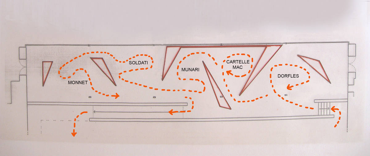
4.1 mostra Omaggio a Gillo Dorfles – il pittore clandestino – pianta schematica della seconda sezione, il MAC

2.2 ingresso e box 1
2.7 l’affaccio sul parterre
2.8 idem

4.2 scorcio del parterre dal box 3
4.3 affaccio sul parterre
4.4 seconda sezione, il Mac – la struttura espositiva
4.5 idem
4.6 idem
4.7 Munari, il mobile
4.8 idem, il gioco delle ombre proiettate
4.9 idem
4.10 Munari, la vetrina con le sculture da viaggio
4.11 la saletta delle cartelle di esordio del MAC – pianta esecutiva del caleidoscopio orizzontale

4.12 il manifesto del MAC all’ingresso del caleidoscopio
4.13 sulla soglia del caleidoscopio
4.14 dalla soglia di ingresso
4.15 il gioco degli specchi

4.16 – XIII Triennale di Milano, Palazzo dell’Arte, 1964 – V.Gregotti, sezione schematica del caleidoscopio
http://archivio.triennale.org/archivio-fotografico/esposizione/21690-13trn
4.17 in cantiere: la struttura di supporto degli specchi
http://archivio.triennale.org/archivio-fotografico/esposizione/21690-13trn (foto n°23)
4.18 V.Gregotti, il caleidoscopio finito
http://archivio.triennale.org/archivio-fotografico/esposizione/21690-13trn (foto n°28)